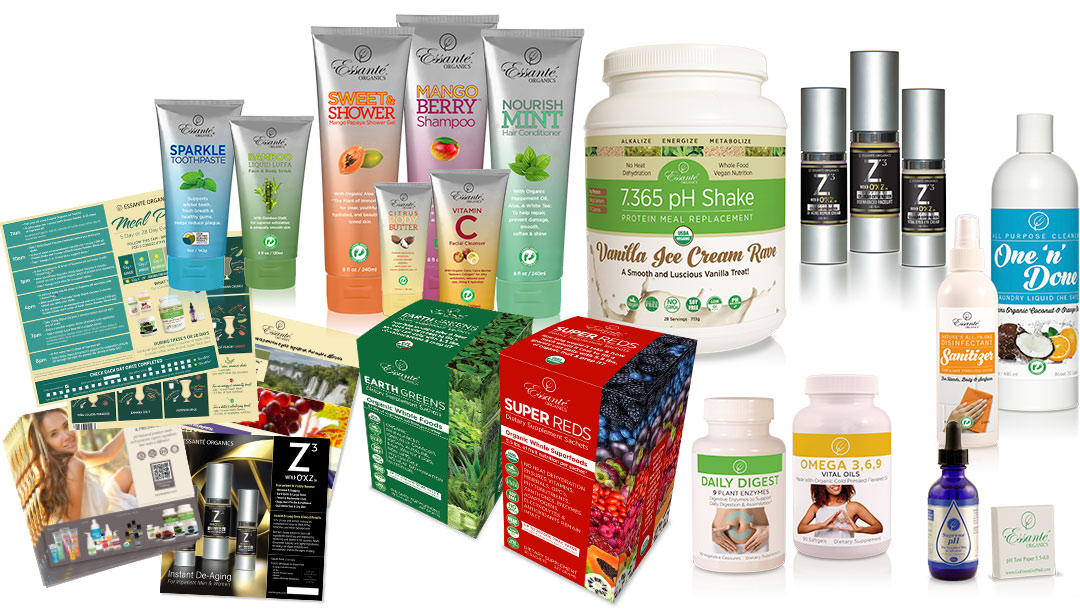
Why a Rendering?
- Feature a product before it has been labelled and filled or manufactured.
- Other than initial photo of container, no further photography needs to be produced.
- As .png file, images are useful to be placed in environmental stock photos or anywhere.
- Useful for catalog placement prior to manufacture.
- Long term high quality image for myriad uses.
- Make edits to existing label without needing another photo shoot, simply swap out the label layer.
- Use template for other labels.
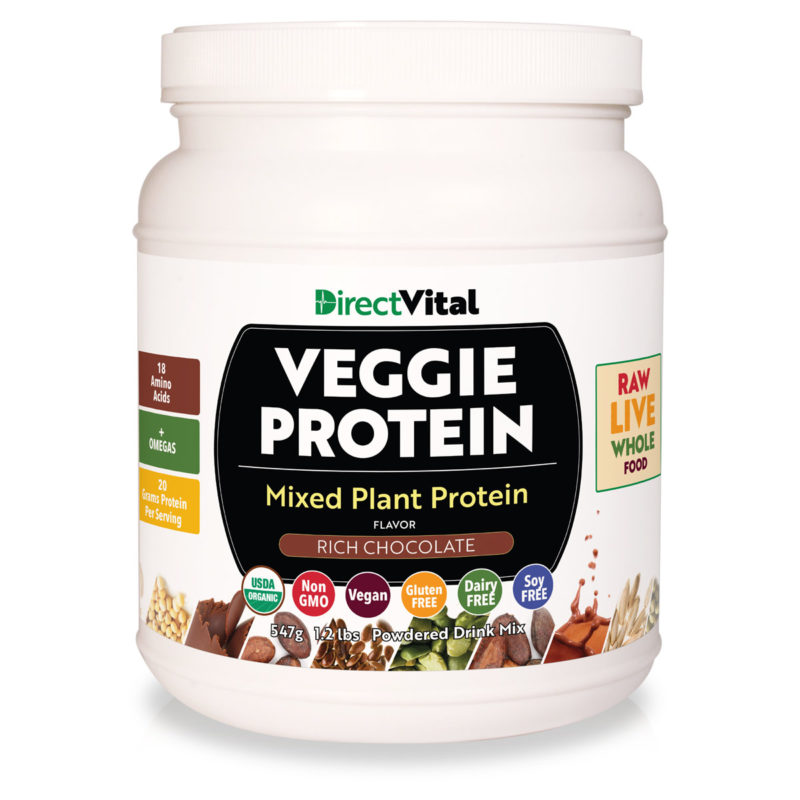
A CLEAN BASE IMAGE
This image below was produced by photographing a clean Boston Round container. An important detail here is that I shot the image with center lighting. With white containers, having multiple hot spots such as a two light option really confuses the visual shape. Having shading on the left and right “turns the form” much better. The simplest way to do this? Here’ s my little secret. Late afternoon or early morning sun. Position the subject with the sunlight on the front. Camera vertically positioned at approximate top third of the container.
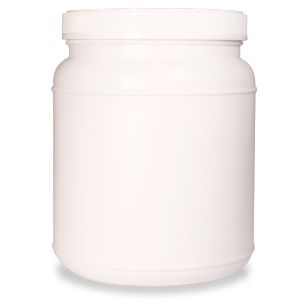
I shoot with a very deep depth of field. I don’t want blurring of detail. I use a plastic semi reflective ground surface to get a hint of reflection, though in some cases I create the reflection simply from the container itself flipped vertically. It’s just an indication that there is a reflection below in the shadow area.
Once the container has been photographed, I silhouette it in Adobe Photoshop. This has to be a very clean careful outline vector. I use 2-3 pixels of “feather” to get a more realistic cut out shape.
The shadow is simply an ellipse in black, blurred and transparent to about 30.
That gets us a really nice base image.
THE LABEL
The label itself, usually produced in Adobe Illustrator, is exported at 600 dpi. This is converted to a “symbol” in Adobe Illustrator where I use 3d tool to wrap it around a cylinder shape. I bring the base container in behind the label to tweak the perspective until I think it looks right.
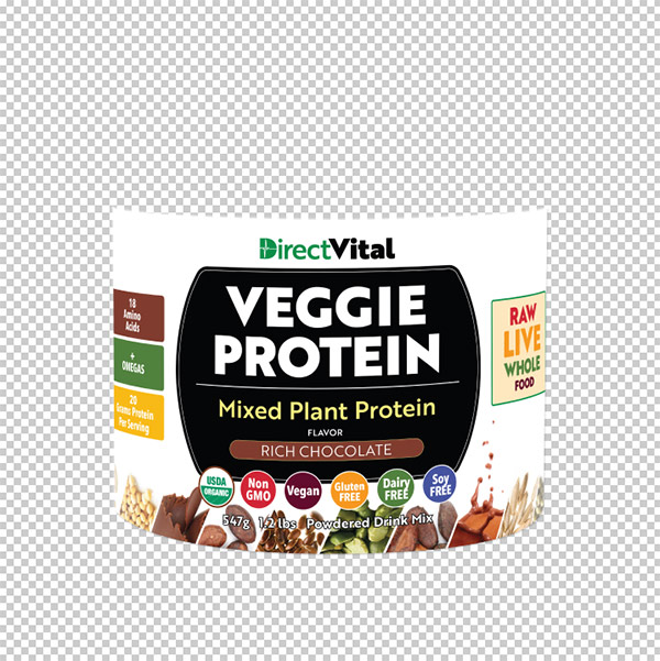
This label wrap is then imported as a “smart object” where I can position it in relation to the container shape. I take the time to produce a vector outline for the label itself. This is very important so that I can build a duplicate blank white layer behind the label. The resulting top layer is the label design, which I convert to “multiply”. The new blank white layer behind the label can now be set to a semi transparent setting which allows the shadowing of the container to show. This causes a more realistic “turning” of the form. In other words, the shading can come through the label a little to make it appear that it is wrapping around the container.
I then produce one image with the shadow and reflection and one without. I get rid of the white background and soft blur the reflection to transparent rather than to white. This gives me maximum flexibility for placing on a variety of photographic or other backgrounds without any white pixels giving away the illusion.
That’s the simple explanation. I know. It’s not that simple.
