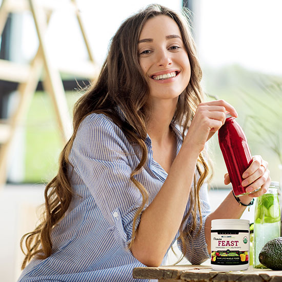
[vc_row][vc_column][vc_column_text]Funnel pages are long, hypey, wordy, sales-y, but they work! This required a lot of HTML detail work. The text from top to bottom is constantly changing color, size and style. It’s supposed to be very energizing. Which in this case, particularly portrays the product very well. Rezealiant Feast is an amazing product with 83 superfood sources in one convenient powder. One scoop and you are good to go for the day. The owner Uri LeBaron approached a marketing group to promote this one product, even though there are numerous other products that he has formulated for Rezealiant Living; an affiliate program.
The page is responsive. The strategy I used to have a split concept at the top zone of the page was to hide the responsive version on desktop view, and reveal it upon mobile view, and hide the split concept there. It meant more production work, but it assured a reliable reduction and kept items in a predictable order.
The funnel page can be viewed here:[/vc_column_text][vc_btn title=”VIEW FUNNEL PAGE” link=”url:https%3A%2F%2Frezealiantliving.com%2Fpremiumfeast%2F||target:%20_blank|”][vc_btn title=”VIEW MAIN WEBSITE” link=”url:https%3A%2F%2Frezealiantliving.com||target:%20_blank|”][/vc_column][/vc_row]

